
Amelix
The logo for Amelix, an all around provider, is an elegant, modern symbol that can be used in print and digital media as well as on uniforms and other business assets. The logo showed that the company was embracing its digital footprint, which it used to develop a new brand strategy and to communicate with customers.
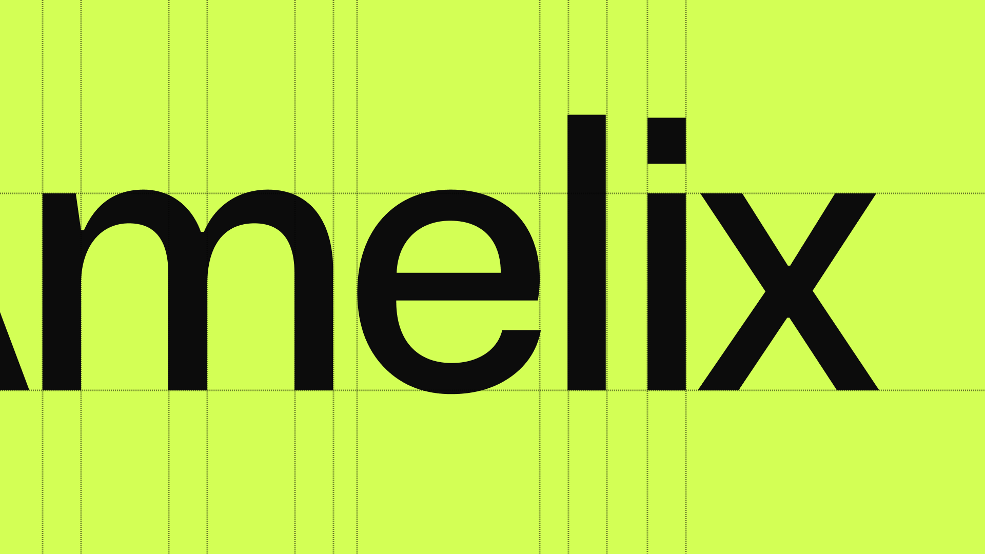

The tone of this project is unique and engaging. The brands name, logo, and tagline are all designed to be bold and bright while still maintaining a sense of elegance. The color palette is meant to be lively, with the primary colors being orange, yellow, green, and blue. The wordmark is also extremely simple yet effective; it uses only a single font choice to convey the brands personality: black on white.


The tone of this project is unique and engaging. The brands name, logo, and tagline are all designed to be bold and bright while still maintaining a sense of elegance. The color palette is meant to be lively, with the primary colors being orange, yellow, green, and blue. The wordmark is also extremely simple yet effective; it uses only a single font choice to convey the brands personality: black on white.
FRO STUDIOS AB
ORG NR: 559318-1083